
Website & Product Catalog Repositioning
5 pain points .01
5 pain points we solved for
-
Inconsistent messaging and positioning for CloudBees' entire product catalog.
Solution: Through discovery, we collaborated with product teams to identify customer engagement patterns and tested messaging to find the most effective for our target personas. By addressing customer issues and clearly communicating solutions, we enhance understanding of our products and their benefits.
-
Lack of product narratives led to gaps in launching new CloudBees products or features.
Solution: We filled product line gaps by engaging customers in a meaningful dialogue about their challenges. Using component design and refined content, we created a compelling messaging approach with videos, testimonials, and market evidence for an enhanced product narrative and website experience. Improved information architecture and navigation models ensure a lasting and memorable customer experience.
-
Website UX the was the product of numerous visual uplifts that had no universal design systems approach.
Solution: Acknowledging past mistakes of focusing solely on certain aspects of our UX and branding layer, we've embraced a holistic design systems approach. This ensures improved consistency and scalability across our entire design framework.
-
Front-end stack challenges led to a complex rollout of the experience layer.
Solution: Strengthening our partnership with engineering, we improved collaboration between Design and Code, speeding up delivery, enhancing quality, minimizing testing dependencies, and fostering a better working relationship. Transitioning to standard frameworks allowed us to align design properties with CSS utility classes in a 1:1 system, promoting efficiency.
-
Brand strategy and limited resources led to a shortage of usable design material.
Solution: Developing versatile brand tools enhanced our design execution, establishing UX digital design as a core foundation for other teams to build upon.
We gained valuable insights while exploring key areas. Pinpointing the main reasons for past project failures, we made adjustments and collaborated across functions to achieve more lasting and scalable results.
22 $
Million in website sourced pipeline
Website and product launch momentum Sept. 2023 to Feb. 2024
What was achieved
- New product positioning
- New website and content strategy
- New visual identity tools
- Better lead funnel management
UX tooling for success .02

UX page anatomy
Every UX component theory influences content hierarchy quality, improving content display tools and enabling the construction of convincing narratives for visitors to understand our value.


Show the product
With a swift introduction to product experiences we facilitate a quicker understanding of our products and their benefits.

Tabbed experiences
This component it allows seamless transitions between product capabilities, listings, or persona-specific content.
Using animation, illustration, screen treatments, and image enhancements can add definition to our key messaging, topics, and product features.

Tools for persona segmentation
This component enables crafting content, messaging, and resources for specific personas, utilizing this targeting in campaign-specific landing pages.

Lead with reinforcing evidence
Various tools are employed strategically to incorporate market evidence seamlessly into our pages.
This approach is aimed at enhancing confidence in CloudBees, reinforcing our positioning within the market and solidifying the perception of our products and company.

Utilities for cross-linking strategies
These utilities streamline meaningful connections between related content, enhancing navigation and user experience.
Additionally, this approach benefits SEO by improving content discoverability and site structure.

Driving demand and valuable leads
Using various calls to action, drivers, and engagement utilities to efficiently guide leads into appropriate scoring channels.
Patterns & Systems .03
UX design patterns and adopting a design systems approach

Consolidating patterns enabled the creation of systems for specific surface areas
Over time, the website underwent temporary uplifts, deviating from the central design and component system. Centralizing design in a series of Figma libraries enabled both internal and external teams to collaborate and maintain consistency.
We addressed inconsistencies by aiming for a 1:1 design-to-coded component system, resulting in scalable approaches to our design and brand style libraries, which facilitated efficiencies in collaboration with internal and external teams.
These systems improved speed and quality for engineering teams, UX design, and image asset production, streamlining content, engineering, and page publishing operations at scale.
UX advancements impact other company ecosystems
Strengthening our digital design brand identity influenced both corporate and product identities. We achieved this by standardizing design resources in libraries and providing documentation and support for teams to adopt these principles.
All components, whether designed or coded, maintain a one-to-one relationship in both design tooling and code frameworks

Components and code patterns
This speeds up design-to-delivery, fostering a more collaborative design and engineering relationship.

Better partnerships with engineering have better results
Figma variables and attributes are used to ensure all grids, widths, spacing, type rule sets, and colors have 1:1 match with CSS utility classes and all inspectable names are aligned with our front-end frameworks.
Interaction patterns, including animations, transitions, speed, and interaction states, are documented with shared design-to-code relationships.
Branding patterns and operations

Improving brand design and UX operations
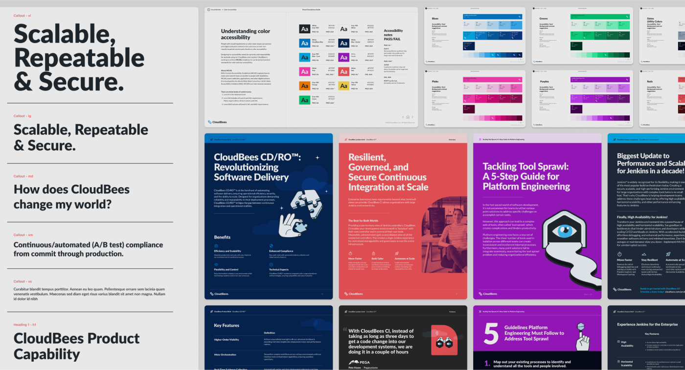
Through shared libraries, centralized design theories, and user research we ensured scalability, accessibility, and usability standards across our entire organization and digital surfaces.

Color, contrast, type, and... code, accessibility is very important
Ensuring type and color accessibility is fundamental in every brand standard. We enhance code standards with semantic HTML, ARIA attributes, keyboard navigation, and proper labeling to address issues and promote inclusivity, complying with web accessibility standards through regular testing.

Messaging meets illustration
Defined a new brand and communication theme using illustrations for conceptual messaging, adding personality to our UX work. Instead of stock photography, we used illustrations to articulate messages, providing a broader set of messaging utilities.
CMS operations, publishing, content strategy, and messaging patterns align seamlessly with design

Optimizing content and design production by building a closer relationship between content authoring and design
We streamlined content development to resources aligned 1:1 with our component system, design materials, and CMS authoring experience.
Streamlined operations create better results
- Design libraries define components and page types, directly ship to Code and CMS models.
- Content authoring, revisions, workflows, and tools are orchestrated to align teams and encourage valuable collaboration.
- Seamless content authoring across design, content creation, code layer, and CMS tools.
7 Days
Landing page design to CMS publishing
The product and landing page design to publishing timeline has been reduced from 4 weeks (two sprints) to just 7 days, with most of the focus on streamlining content revisions and publishing tasks.
7 Product updates
Launched products, released features, and repositioned existing products
1 New SaaS product platform launched
2 Major product feature launches
4 Existing products repositioned
40 %
Time on page / time on site increase
Improved navigation, cross-linking, and page flow significantly increased customer engagement, lead conversion, and scroll behavior, extending time exploring CloudBees' value.
Before and After study .04

Before and After
Before-and-after study, we highlight website transformations, improvements in user experience (UX), enhancements in design, and shifts in content/product positioning achieved through our targeted initiative.

Before... Inconsistency in the customer experience
Initially, the website and product catalog had disjointed branding, defined in odd ways. We used multiple frontend display frameworks without a cohesive component design approach and lacked definitive styling libraries.

After... Advancement in design as a systems approach
Adopting a design systems approach, we achieved sophistication, ensuring consistency, speed, and quality in UX and visual designs. This involved seamlessly integrating coded and designed objects through established systems for typography, layout, spacing, and component construction.

Shared change
Establishing standards, libraries, and materials had a significant impact on the evolution of brand materials, spanning print, digital content, PDFs, internal comms, slide decks, and in-person event experiences. This influence extended to methodologies within product teams' design standards, shared through published libraries.

Before, after, and next...
End outcomes
The goal was to foster a collaborative environment, combining strong partnerships, streamlined operations, effective tooling, design thinking, team education, and strategic marketing efforts for higher value, scalability, and success.
Transitioning to a product model brings deliberate focus and accountability across teams and disciplines, providing a stronger foundation to build upon.
The strategies paid off by increasing value in production workflows, messaging meets content strategy opportunities, and making infrastructure changes easier to maintain, track, and scale.
Visit the CloudBees site →Who am I .05

Mike Rusczyk
My product design expertise stems from a skateboarding background, fostering adaptability and turning challenges into innovative opportunities. I prioritize a design process that seamlessly blends functionality, logic, and a distinctive aesthetic to meet technical standards and create emotional connections with users.
Leading design teams with a focus on technical precision and creative insight, I integrate a comprehensive historical perspective into enduring, highly functional designs. In my diverse marketing roles, I've gained a deep understanding of creating successful brand experiences. Focused on navigating the evolving digital communication landscape, I shape compelling narratives that contribute to the overall success of the products I work on.
On Linkedin →